
The brief
A couple relocating from London wanted their first Stockholm home to feel light through the long Nordic winter without losing the warmth of collected objects — ceramics gathered on travels, a wall of well-read books, and an inherited oak sideboard that had to find a permanent place in the new plan.
The apartment occupied the third floor of a 1960s Östermalm block: good bones, generous ceiling height, and a south-facing courtyard aspect that the original layout almost entirely ignored. Dark walnut panelling swallowed what daylight there was, a run of compartmentalised rooms broke the flat into corridors, and the kitchen turned its back on the courtyard altogether.
Our brief settled on three moves. Open the living axis so light travels from the entry straight through to the window wall. Replace the heavy palette with tactile, low-chroma neutrals that hold warmth on a grey February afternoon. And bury storage inside the architecture so the 118 m² footprint reads considerably larger than the floor plan suggests. Nothing flashy — just a quieter, brighter version of the flat the clients already half-imagined.
Main spaces
The single most important decision was structural restraint: we removed just one non-load-bearing wall and widened the kitchen opening, rather than gutting the plan. That alone let courtyard light reach the dining zone for the first time, and kept the project on a renovation budget rather than a rebuild.
Pale smoked oak now runs continuously from the entry through to the window wall — one material, one direction, no thresholds — which is the quiet trick that makes the flat feel like a single connected space. We kept the ceilings white and matte so they bounce the thin winter light deeper into the rooms, and specified limewash on the walls for its soft, chalky depth that photographs beautifully at every hour.
Built-in banquette seating along the dining wall freed enough floor area for a round table that seats six without anyone squeezing past to reach the kitchen. Circulation stays generous, sightlines stay open, and the collected objects the clients love finally have room to breathe.
Smoked oak flooring, a bouclé sofa, and a vintage Scandinavian rug anchor the main seating group against limewash walls.
The kitchen is where the restraint pays off. Fronts are matte lacquer in a warm Bone White, paired with a honed limestone worktop and a run of the same limestone up the splashback so the whole surface reads as one calm plane. Handles were eliminated entirely in favour of shadow-gap pulls — a continuous recess that keeps the cabinetry looking like joinery rather than a fitted kitchen.
Appliances disappear behind a concealed bank, so nothing interrupts the line of the units. The one deliberate flourish is the pendant over the island: a 1970s Opaline glass globe, sourced at auction, restored and rewired. Against the otherwise disciplined palette it reads as jewellery — proof that one warm, imperfect, period object does more for a room than a dozen new ones.
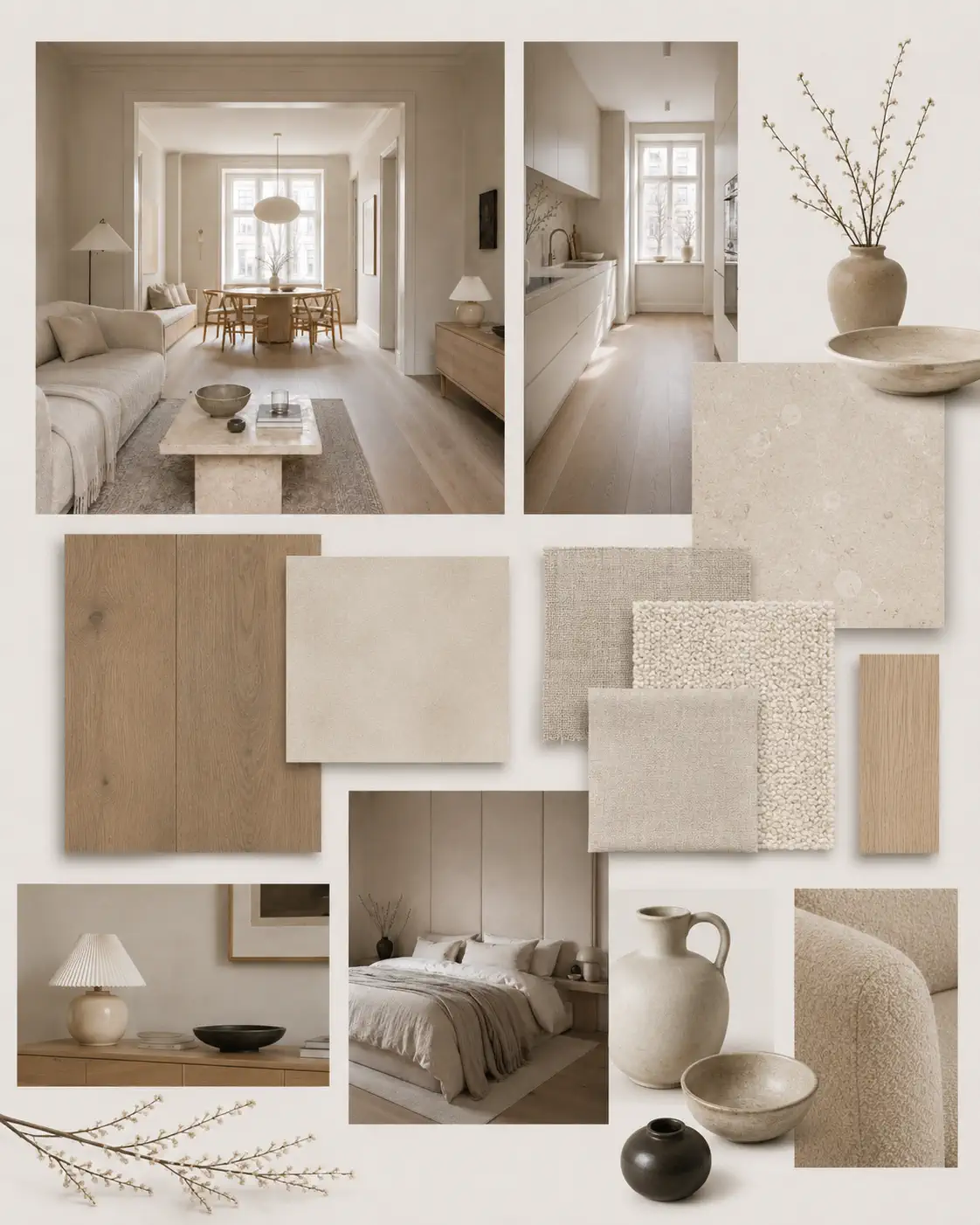
Primary bedroom — a full-width linen headboard wall fronts the concealed wardrobe, its flush doors disappearing into the limewash.
Six months after handover the clients report that the flat feels close to twice the size, even though the footprint never changed by a single square metre. That is the whole argument of the project in one sentence: editing the structure and keeping the materials honest almost always matters more than adding floor area.
The inherited sideboard sits in the entry hall where it catches the first light of the day, the ceramics have room to be seen one at a time rather than crowded on a shelf, and the long Nordic winter — the thing the brief most feared — now arrives as soft light on limewash rather than gloom behind walnut.